It’s ironic that I work in education but I don’t know how to make an art tutorial, so here’s my sad attempt! Forgive me if it’s useless.
I LOVE drawing hair, it’s always been my favorite, although I’m a bit of a perfectionist and therefore hair is usually the part that takes me the longest when I work on a piece. It involves a lot of experimentation and drawing the same lines over and over until I get the right shape or flow and it requires a lot of patience (at least for me). Is there a right way to draw hair? Of course not! That’s the beauty of it. Every artist is unique and will have their own style, it’s all about trying new techniques to see what works best for you. *blows kiss*
Okay here we go!
I generally have three main steps: a loose sketch, a more refined sketch to build a cleaner design, then the final lineart. I also tend to make about 3 or 4 sketches to find the right hairstyle or flow. (I’m also indecisive as f**k)
Things I think about:
Action, dimension, shape, flow, movement and how it’ll interact with the body or what’s around it
Is there wind? Is the character outside? What are they doing and how would the hair respond to that? Is it pulled behind the ear? Wrapped around the neck? Tied up?
References and inspiration – I always use a reference of some kind just to remind myself what I like or what I want to see, it’s the best tool to keep myself on track. Sometimes I even use my own art just to see what how I’ve done it before and what I liked about it. Don’t be scared of reference! (Example: Alphonse Mucha’s art is a major inspiration, I LOVE his use of line weight, shape and flow)
Using Gladio’s face from a wip I’m currently working on, I tried to draw some of my process out:
(Is it blurry!? Did I screw this up? Oh well, let’s keep going!)
Steps:
Sketch – Loose and messy gesture lines to show the general shape and movement. It’s okay if your sketch looks like a hot mess, it’s supposed to!! I have a hard time staying loose myself, so I’m working on that. Usually my sketches are very dramatic haha.
Refined Sketch – This is where I start to actually define the strands and the general shapes. By using my sketch as a guide, I can then build the design and the more individual strands and how they interact with each other. This can take a while (like it takes me hours). I try to go slower and I’ll end up reworking it a few times before I’m happy. Tip: reverse your canvas! It helps you see if your hair is more or less balanced or if something looks off.
Final Lineart – At this step, I strengthen my lines and erase lines where I want the flow to be more continuous. I also add detail lines and extra strands or flyaway hairs for a more interesting or complex design. The example above is still too messy or simple for what I normally like, but that’s okay. Also, what the heck is up with that messy bun? What am I even doing?
Final points:
Find inspiration and examples of what you like! This can be from other artists, movies, nature – literally anything. References are your best friend.
Experiment and try new things – I’m always trying to push my designs further and learn new skills
Keep your sketches loose and messy! I like to warm up by drawing circles, ovals or like the infinity/8 shape over and over again.
Play with line weight and thin vs thicker hair strands. Have the hair interact with something, whether it’s an ear or a shoulder or itself. Push yourself for an interesting design. (Gotta push myself too! It can be a frustrating process)
The more you practice, the better you get (cliche, but it’s so true)
Honestly, I don’t even know what I’m doing half the time and my skills have a long way to go. So we’re on this hair journey together! ❤
BONUS!
Here are a couple Gladio sketches that I never posted on tumblr as an example of a messy sketch vs a more refined sketch
Apparently I really like drawing Gladio shirtless Okay hope this was somewhat useful! ❤
Hey! I made new drawings of one of my favourite anime and I’m very happy with the results after all the time I spend on them, worth it. Hope you enjoy them!
This piece will be showing this Saturday at Santa Ana’s artwalk in the Lineage show at B-minus Studios and C J Sitton. If you are in the area please come by and see the exceptional artwork!
This may my best friend Kikaigaku and I, have started the challange to draw every water type Pokémon like a mermaid! Here my part for the first generation!
Reposting cause something… strange happened to the formatting on the last one lol… anyway, I’ll be drawing these two often, working on a project called ‘Far Out’ and it’s simply abt a nature loving monster showing a bounty/monster hunter how to appreciate the world and life ❤
Texturing is a technique that involves
adding local shading and details on surfaces to better represent the
material of an object.
This technique is of course closely linked to shading in general. This is usually applied after defining a global shading.
From left to right :
Lineart
Global shading
Completed sprite
One of the big differences between global and local shading is homogeneity. The
very principle of global shading is to give a sufficiently contrasting
effect between the shaded and lit areas to bring out volume and depth.
Conversely,
a texture must be as homogeneous as possible. It must be able to be
applied on large, uniform surfaces, without making it look bad.
2. Applying a texture
A
texture being homogeneous in terms of its luminosity/contrast, if it is
applied to an object without taking into account the global shading, we
will lose any effect of volume and depth.
A texture applied to a sphere without shading. Only the deformation of the texture can give us a clue on the shape of the object, but it is still difficult to discern.
Homogeneous contrast
When applying a texture to an object, shadows must also be taken into account. It
is therefore important to maintain a uniform contrast between colours. A
dark line separating a light zone from a dark zone should not keep the
same colour between these two zones.
The color of the line will be lighter on the lighter side and darker on
the darker side to preserve its contrast with the background.
In
the same way it is possible to apply a texture or pattern on a shaded
object, by proceeding to a simple color shifting in our palette.
Combination of a texture (left) and an object that is not textured but shaded (middle).
3. Local shading
Since shading is used to highlight the bumps, there are generally two possible cases:
A groove
A bump
Each of these cases can be more or less accentuated by playing on the colors, the intensity of shadows and lights.
On the upper line, troughs ranging from the weakest to the strongest bumps. On the second line, these are bumps that stand out.
The
mastery of these light bumps is very important, it is the basis of the
textures, and will make it possible to manage all the simple cases, such
as wood or matte plastic.
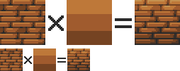
Example of application on a simple object:
4. Reflections
The application of a reflection is done in a
simple way, by applying diagonal strips of light of varying
thicknesses, and following a few rules.
A trough or bump will create an offset at the reflection level (proportional to the height change). As
for the shadows, there is no absolute, depending on the palette or the
material represented, it is possible to lighten or not the area at the
reflection level. It is also important not to have parallel light bands on faces that are not oriented in the same direction, as on this cube:
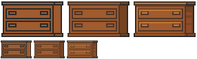
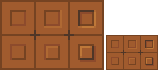
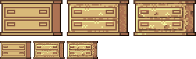
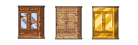
Concrete example of the application of a gold texture on our drawers:
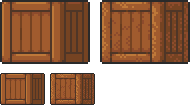
Or, added reflections on our previous crate:
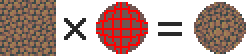
5. Dithering and granularity
Dithering consists in
creating a new false color from a checkerboard or other regular pattern
of two colors close enough to give an illusion of mixing. The closer
the colours are, the stronger the illusion will be. The more the colours
are contrasted, the stronger the granularity effect will be.
Dithering is basically used to obtain fake intermediate shades on
limited palettes, but it is also very useful for making complex and
rough textures.
Example of complex dithering separating 3 colors over a wide area.
The nature of the pattern totally changes the roughness aspect.
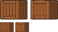
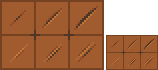
Example of the application of a sandy rock on our drawers:
Or add grain to our crate:
6. The art of destruction
The more complex a texture is, the more it will combine fundamental techniques such as bumpiness, reflections or granularity. However, some materials need to go further, by cutting, slash or breaking the base support.
Cuts It works much like bump, but on a much finer surface. We are subject to the same rules, of which here is a summary image:
From the finest to the most pronounced, on the first line of the cuts, and on the second of the bumps.
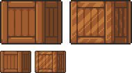
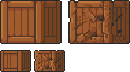
A concrete example on our crate:
Exercises
Since nothing beats practice to learn, here is a series of examples from the simplest to the most complicated.
For each exercise resolved, post your results.
Mastering tools
Add
a strong bump on the text of this image, except the ‘x’ which must be a
groove (the center must be dug more strongly than the rest of the ‘x’):
Palette:
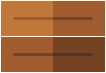
Add reflections on the image obtained between the two red lines shown below:
Now cut and break the letter ‘e’ as well as possible.
Add grain to the letter ‘l’.
Finalize a sprite
Texturize/colorize this sprite:
Palette:
Add reflections on the inside of the doors to give the impression that there are windows.
Add damage (cuts etc) on the right side of the wardrobe.
Make a variant of this cabinet by redoing it in gold using the palette of the gold drawers example in the tutorial. Palette:
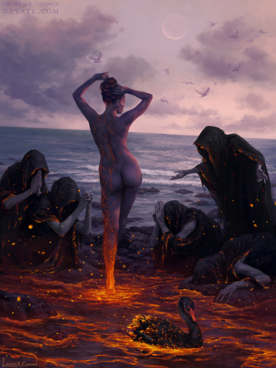
Do any of you know about that one painting with Aphrodite being born out of lava with a black swan by her side or did i completely hallucinate that? Been searching for a while but i can’t find it for shit.
I tried googling that description but no luck either, anyone might know what painting this might be (or if it does exist? cause it sounds sick lol)
It took a bit of googling magic, but I think I’ve found it.
my advice: have fun and play–play is learning | always be watching real life to see how things move | also be watching cool animations to learn from them | don’t wait until you’re ‘good at art’–animating will help you improve | it’s hard but so worth it when things turn out well, good luck!
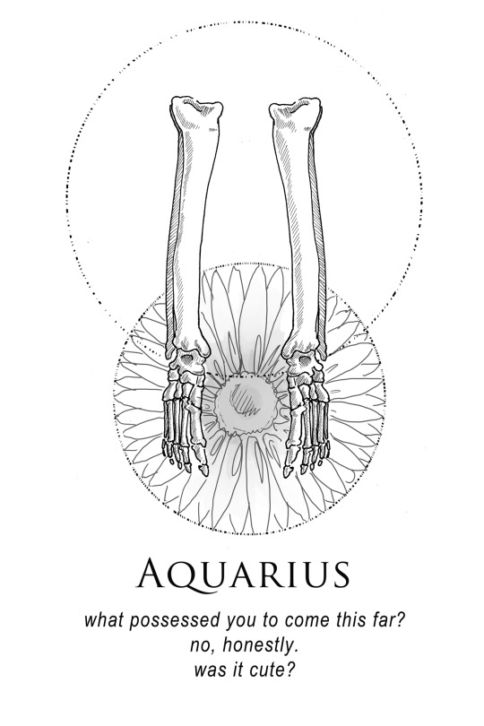
shitty horoscopes book ix: the body and the wreckage.
each sign rules a body part, though which part will vary depending on who you’re talking to. this volume marks a year to the inception of the shitty horoscopes series.


